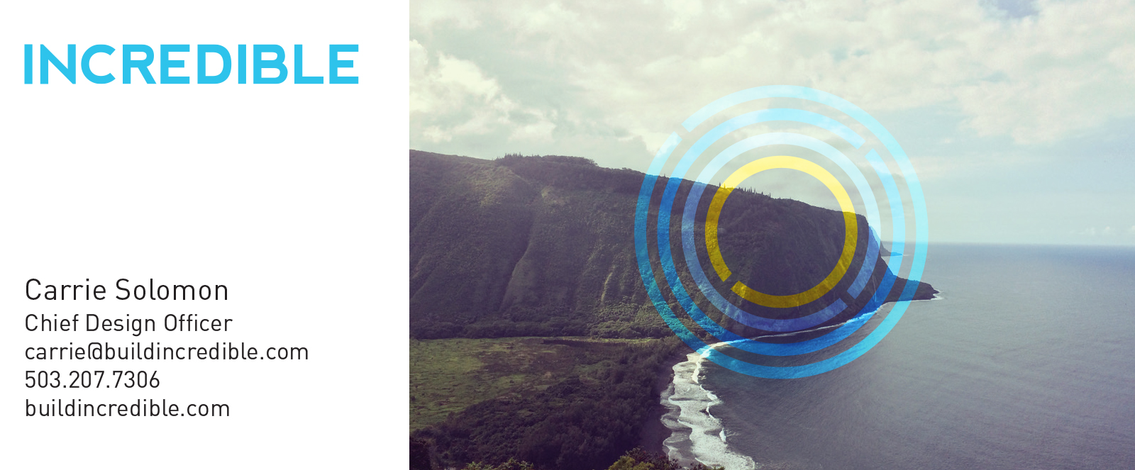
INCREDIBLE
CREATIVE DIRECTION, BRANDING, BUSINESS DESIGN, STRATEGY, MANAGEMENT
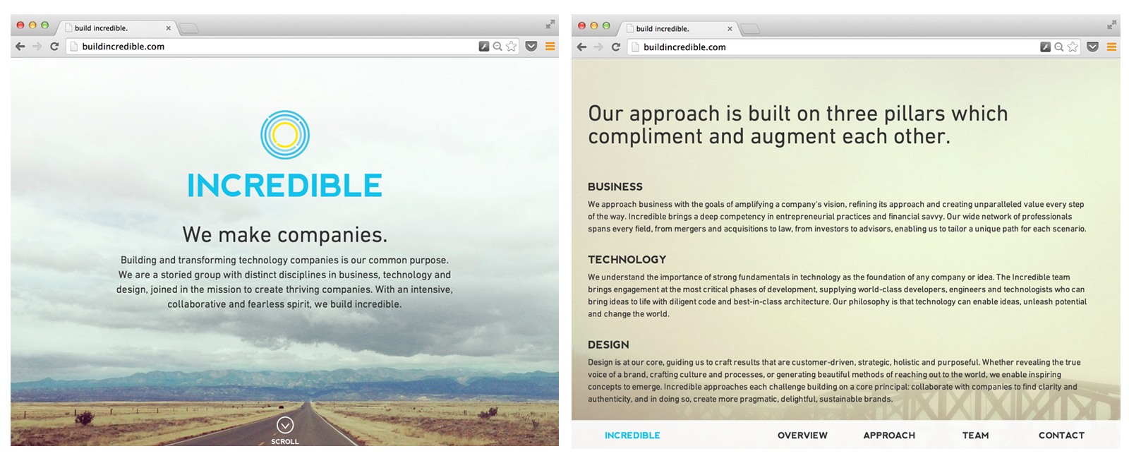
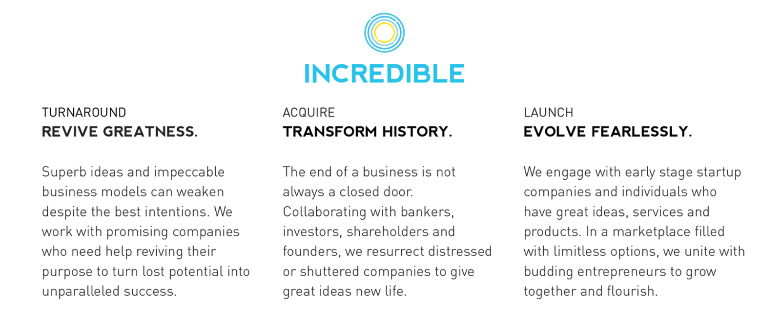
Incredible is a collaborative team that strives to resurrect failing technology companies, as well as companies and brands in a state of transformation growth, with goals of starting, scaling and evolving.
As co-founder, I helped to craft the messaging, core values and approach of the entire company. A catalyst for design in all aspects of Incredible's approach, I have played the crucial role of representing an attention to design and generative thinking in all aspects of development, business and strategy for our technology-focused clientele.
In the early stages of its development, attention has already been garnered by Incredible, with repeated accolades for the inspiring messaging and ethos put forth via digital media. This attention has led to a vast number of leads in a short amount of time, within six months since launch.
EB & BEAN
BRAND AND IDENTITY DESIGN, INTERIOR AND RETAIL EXPERIENCE DESIGN, CONTENT CREATION, UX
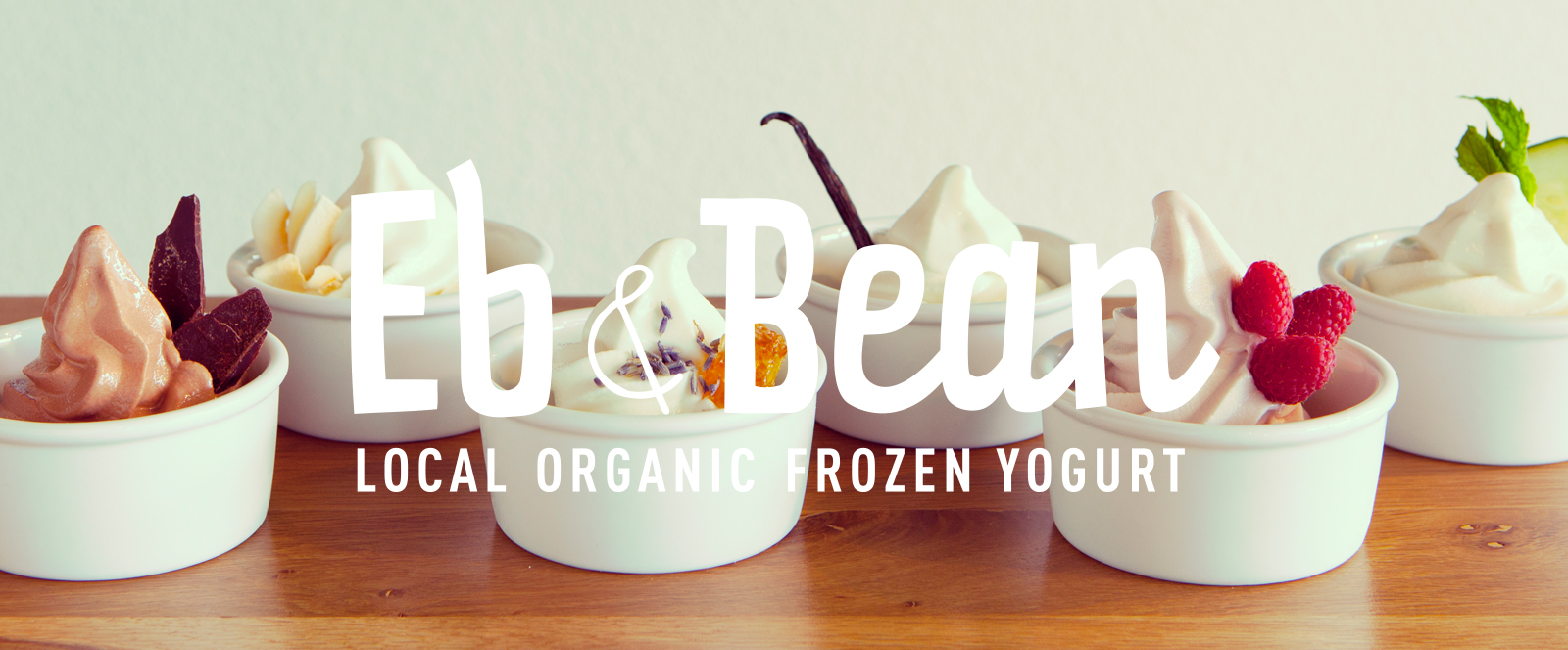

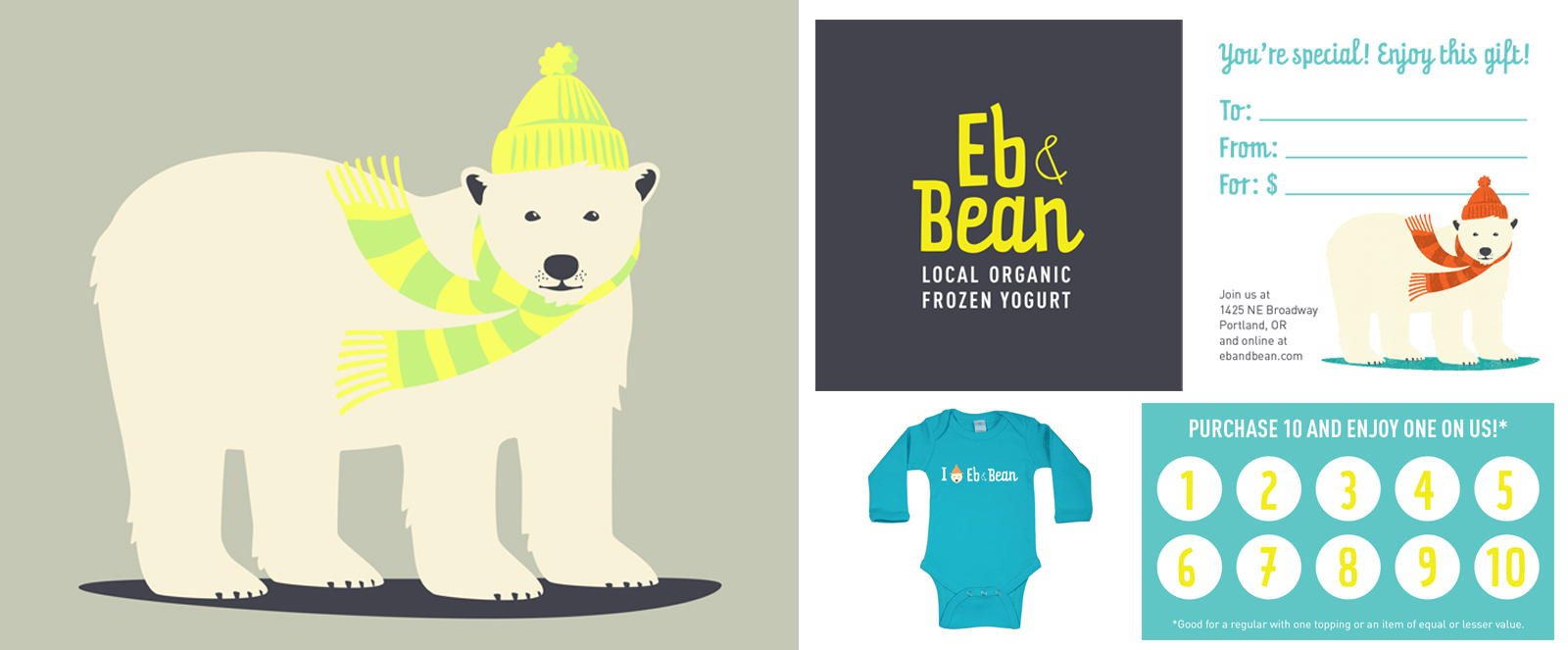
Eb & Bean is a new concept for frozen yogurt. The first of it’s kind in Portland, Eb & Bean serves the finest organic dairy, paired with awesome, artisanal toppings, all in a probiotic-rich package without. Unlike competing frozen yogurt shops, the shop sources its dairy from local farmers where the cows roam free and graze on pastures, while working with local artisans to offer unique and handcrafted toppings that appeal to yogurt lovers of all ages.
As the sole creative director and builder of the brand for Eb & Bean, I have worked hand in hand with the proprietor of the new company, helping to tease out the core values and mission of her company. I crafted a complete Brand DNA for her to use across all collateral, website, social networking, and for the entire retail experience. From graphic design, to voice, to interior design, I have helped to build the brand from scratch.
JODY AKE PHOTOGRAPHY
BRAND AND IDENTITY DESIGN, CONTENT CREATION, UX
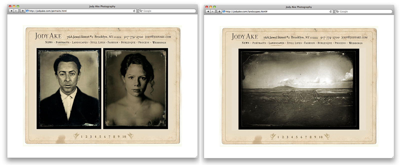
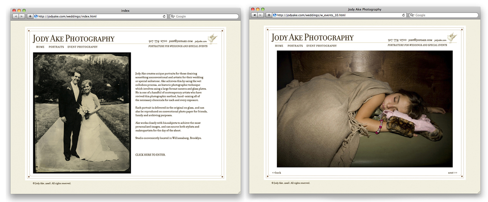
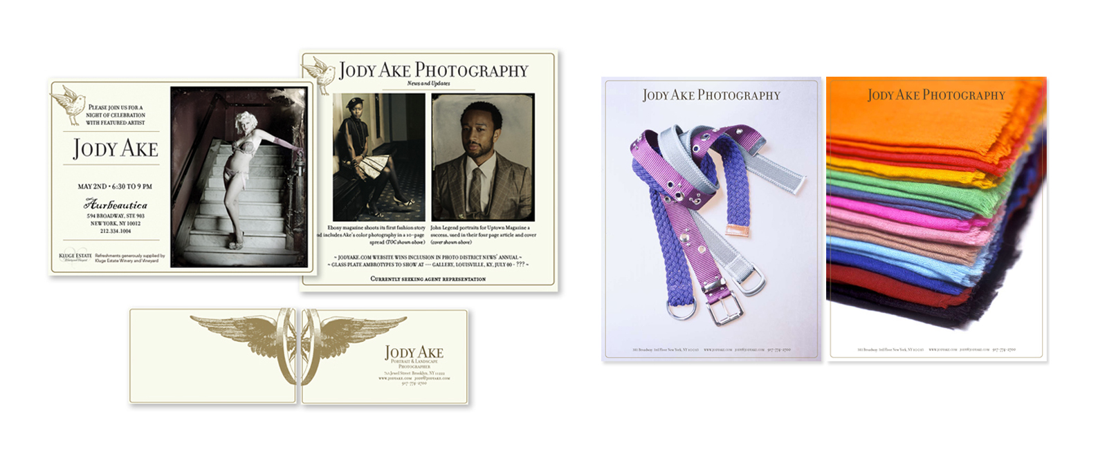
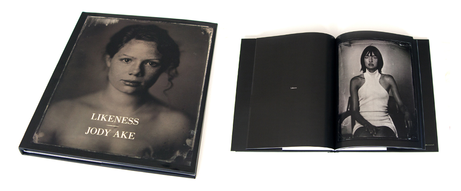
In an environment filled with digital photography and slick online portfolios, Jody Ake needed a style of presentation that immediately communicated his hands-on process of wet collodion, while still holding up to the expectations of his savvy online audience. Inspired by old meeting new, the look and feel of his entire identity system uses the texture and historical significance of the carte-de-visite and traditional typography, combined with the clean and straightforward look of a modern photographer. These components have helped Ake stand out among his competition, where Photoshop is often used to make prints look as though they were created in-camera, the process within which Ake has been working for nearly twenty years.
The design created for him has been flexible enough to address Ake's wedding photography, as well as digital capabilities, as seen in one-sheets and a companion website. Over the years, he has received extensive praise for his unique marketing approach both online and in print.
Included in Photo District News Annual
Winner of top ten website, HOW Magazine online
MICROSOFT CONNECTED EXPERIENCE
CREATIVE DIRECTION, RETAIL EXPERIENCE DESIGN, INTERACTIVE DESIGN DIRECTION, CONTENT CREATION

Consumer understand of the connectivity available from one device to another within the Windows 8 platform was low. Microsoft needed an experiential, retail approach that would clarify the robust nature of their offering and tell a clear story to their consumers. As lead designer and ACD on this project, I initially helped to organize the narrative aspect of the project, then designed most of the elements and directed a complex team to execute.
A writer, graphic designer and interactive design team were included in the fast-paced execution of the project, which demanded multiple, interwoven stories, perfect pacing, and attention to details that would need to function seamlessly in the retail environment. In addition, Microsoft sought to highlight their most recent phone's low-light photographic prowess, demanding an additional, physical component to the kiosk that would allow users to test out the camera. In response, I concepted and designed a tactile diorama that was both functional and fun, creating a highly compelling, interactive element of the experience. It was both physically integrated into the overall kiosk, as we as added user-generated content into the digital experience.
This retail experience was rolled out to numerous key locations, nationally, and also became on of the most popular and long-standing retail displays in Microsoft's executive headquarters.
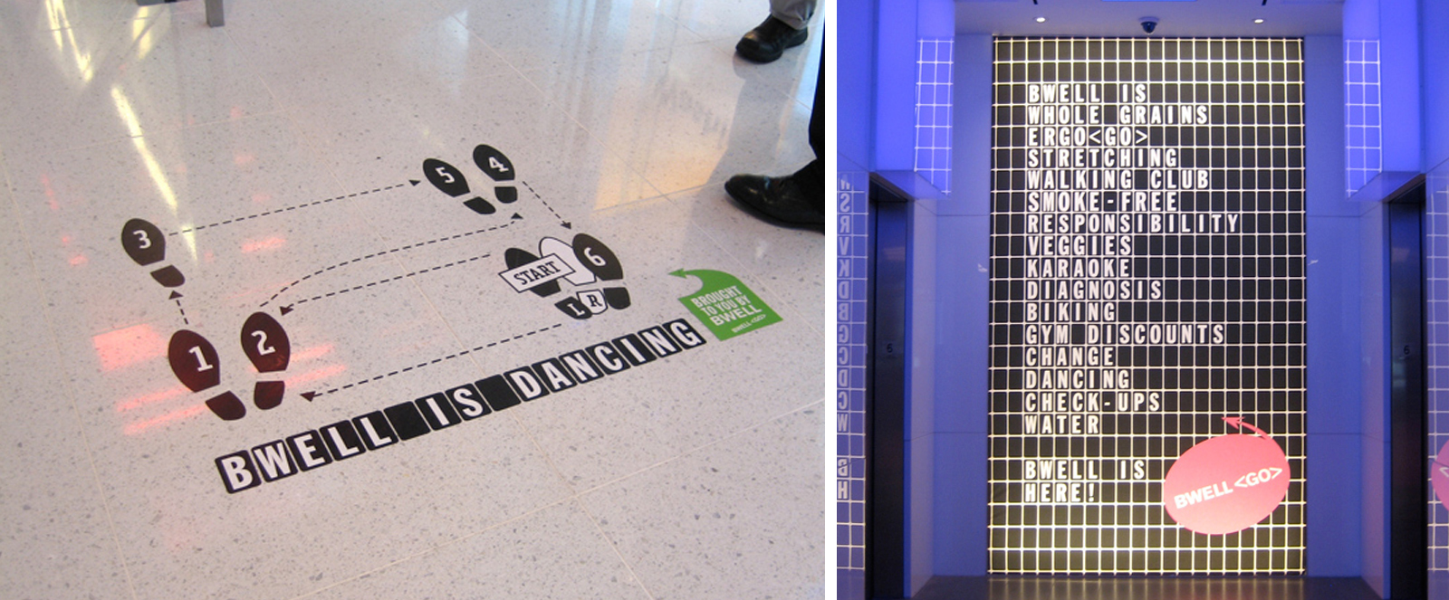
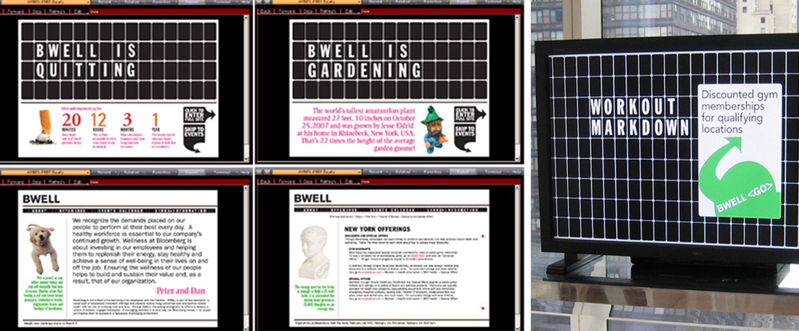
BWELL CAMPAIGN - BLOOMBERG
CREATIVE DIRECTION, CAMPAIGN CONCEPT AND DESIGN, CONTENT CREATION

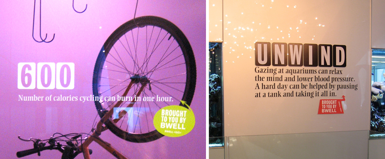

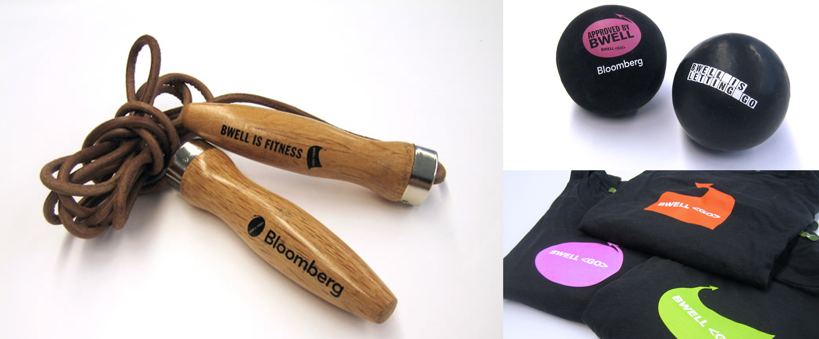
During my tenure as Design Director at Bloomberg, the Professional Development team approached me with the challenge to create a campaign announcing and framing their 2010 Wellness Initiative. Comprised of extensive programming and events, the initiative planned to spotlight the company's renewed focus on preventive health. In order to reach men and women of all ages, and in different stages of wellness, communications had to be rooted in the intelligence and quirkiness typical to Bloomberg's corporate culture without calling out any one particular type of personality.
In order to stand out in the midst of massive visual stimulation and distractions in the office environment, both humor and mystery were used to play off the intelligence and curiosity of the average Bloomberg employee.
The BWELL campaign shows that a variety of unique options, both conventional and surprising, can lead to health and happiness. A consistent theme of play-on-words personifies the initiative with activity and character. The imagery and animation of the constantly changing destination board is the axis for content; while witty, intelligent and evocative copy carries the campaign through a multitude of communications and collateral.
The campaign involved a pre-launch of evocative signage to drum up buzz, and then massive coverage through a comprehensive website, animated plasma screens, promotional events and giveaways. Results from the campaign have shown record sign-ups for events, as well as the catchphrase of "Be well" ringing throughout the halls of the offices and peppering conversations throughout the day.
In-HOWse Design Annual Merit Winner, 2010
2007 GLOBAL SUMMER PARTY - BLOOMBERG
ART DIRECTION, GRAPHIC DESIGN, EXPERIENCE AND EVENT DESIGN, CONTENT CREATION
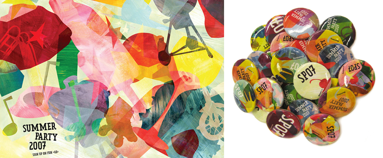
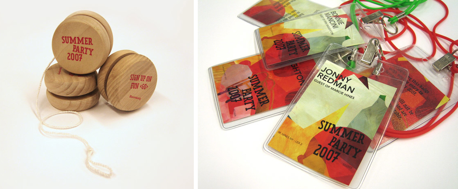
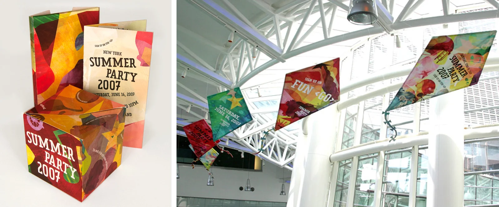

Each summer, Bloomberg throws a massive, global, outdoor party for its employees and their family. The 2007 party design needed to appeal to younger employees who would enjoy the festivities late into the night, as well as to families taking advantage of daytime activities. I crafted this concept based on the graphic style of children's book author, Eric Carle, whose artistic renditions of shapes and colors would appeal to all ages.
Original, bold, colorful painting techniques and heavy illustration were created by hand to show the silhouettes of evocative images representing the promise of events that would be on site. Collateral items such as buttons, promotional "kites" for the headquarters, environmental site graphics for entrances and exits, backdrops for bandshells and stages, giveaways and animations for interactive promotions, all became a part of the design and execution. Ultimately a feeling of joy and nostalgia filled the premises to make attendees aware of the upcoming events, as well as onsite at the celebrations themselves.
CENTRAL PARK CONSERVANCY HALLOWEEN BALL
CONCEPT, GRAPHIC DESIGN, CONTENT CREATION, PRODUCTION
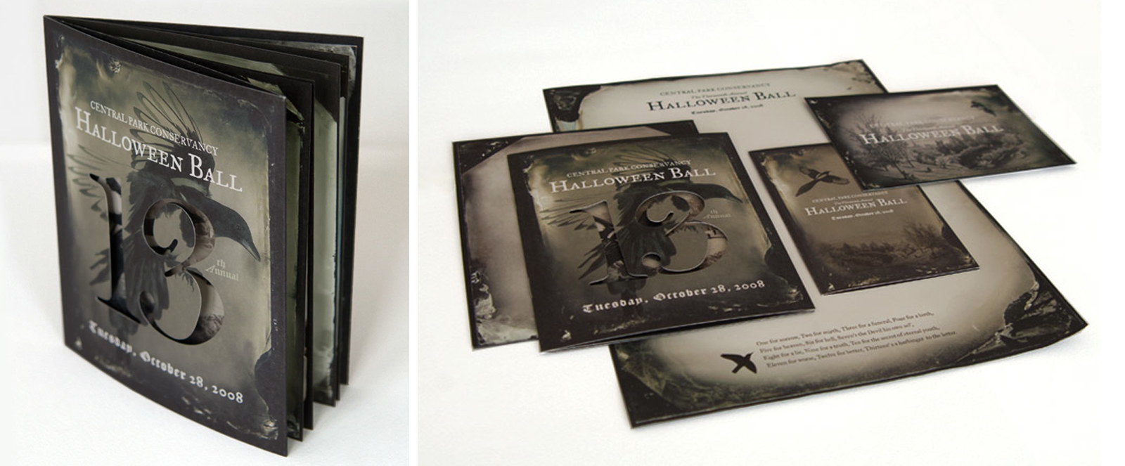
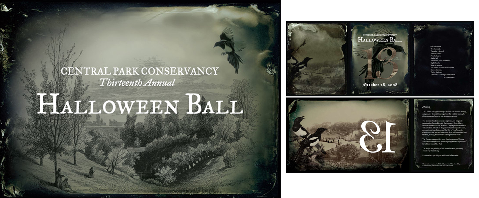
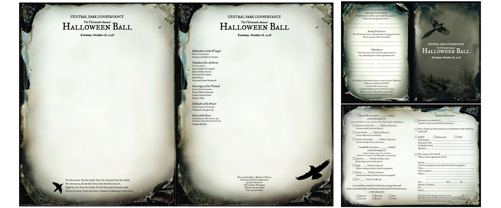
Every October, the NYC's Central Park Conservancy hosts an annual Halloween Ball to raise funds for the park. Elements of elegance, intrigue and beauty were required to represent the exclusive, fundraising event. In addition, a theme for the event needed to inspire each partygoer to create amazing costumes in competition for extremely high end prizes at the highly publicized event.
2008 marked the 13th year of the event, inspiring me to conceptualize the theme of "superstition" for the overall look and feel of the invite, which also guided the event decor and theme for the evening. The recurrent image of the magpie, along with the words of a portentous magpie riddle, grace most pieces of the full invitation and collateral package. Vintage prints of Central Park are married with ambrotype photography for a historical and creepy, but stunning, feel. To remind potential partygoers of the year's mythical number, the numeral "13" is die cut into the front of the invitation, only to open into its own mirror image and form a "31", the true day of Halloween.